Three-Line Bold Cover Template

Use one strong topic, one action, and one benefit to make a cover readable in one glance.

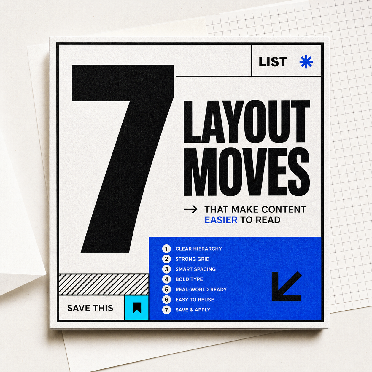
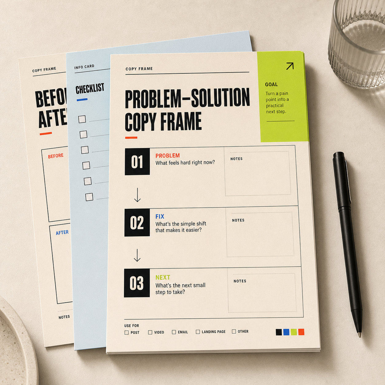
Printed social cover template mockup with bold black type and lime accent panel.
cover

START HERE

MakeYour CoverStop Scrolls

For tutorials, pitfalls, and lists

How to adapt it

01

Line 1: topic

  • Name the object: cover, resume, menu, workout, trip plan.
02

Line 2: action

  • Use a verb phrase: write like this, arrange like this, check these first.
03

Line 3: outcome

  • Promise the visible benefit: clearer, more saveable, easier to scan.

Copy and adapt

Design specs

Color values

Warm paper

#f7f2e8 · RGB(247, 242, 232)

Main background and quiet margin color.

Ink black

#111111 · RGB(17, 17, 17)

Headline, border, and primary text.

Signal red

#ff4b2f · RGB(255, 75, 47)

Small urgency label or one highlight word.

Lime marker

#c8ff42 · RGB(200, 255, 66)

One accent panel, sticker, or underline.

Type and size

Headline

  • Use a heavy grotesk or condensed sans at 56-72px for square social covers, 900 weight, line-height 0.9-1.0.

Support text

  • Use system sans or grotesk sans at 14-18px, 700-850 weight, uppercase labels only when they are short.

Layout rules

Canvas ratio

  • Works best as 1:1 or 4:5. Keep the title inside the left 65% and reserve one accent block on the right or bottom.

Spacing

  • Use 32-44px outer margin, 18-24px inner gaps, and hard 2-4px black borders for the editorial template feel.

Build notes

  • Use 1080x1080 for square posts or 1080x1350 for vertical feed covers.
  • Keep each title line under 12 characters when recreating it in Canva or PowerPoint.

Replaceable parts

Replace the topic

  • Cover title
  • Course poster
  • Travel guide
  • Coffee menu

Replace the benefit

  • More readable
  • More premium
  • More organized
  • More likely to be saved

Avoid when

  • The topic needs a lot of nuance.
  • The audience already knows the context.
  • The visual asset is more important than the title.

Variants

  • For product pages: feature / action / result.
  • For courses: audience / method / outcome.
  • For profiles: identity / proof / invitation.

Usage notes

  • Keep each line short.
  • Use one visual accent only.
  • Make the headline the first thing people notice.

Best for

Social postTutorialPitfall post

Colors

Related ideas

Keep browsing similar structures, styles, and use cases.