数字リストカバーテンプレート

明確な数字で、読みやすく保存しやすい内容だと伝える。

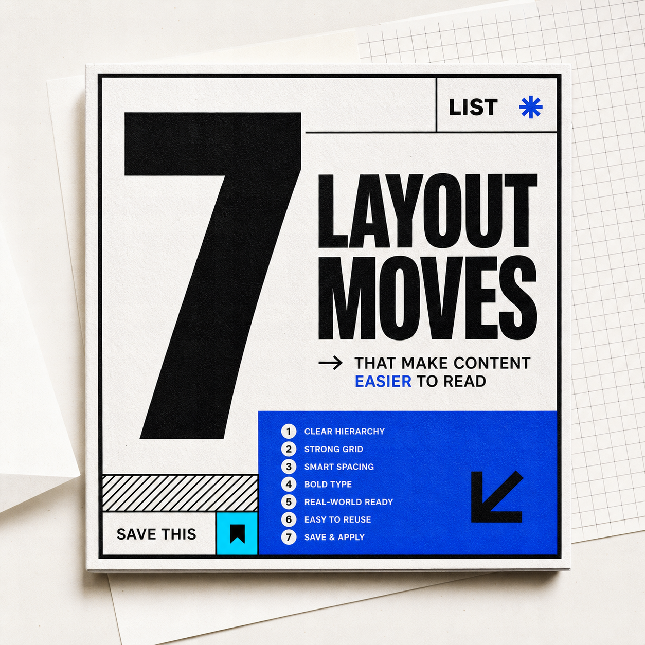
Numbered list cover mockup with a large number, bold title, blue accent block, and editorial paper texture.
cover

保存用

7つの表紙レイアウト小技

日常投稿にすぐ応用できる

使い方

01

数字

  • 3、5、7、10 を使う。奇数は編集感が出やすい。
02

対象

  • リストの対象を書く:ツール、ミス、レイアウト、例。
03

保存する理由

  • 後で役立つ理由を短く添える。

そのまま応用できる例

Design specs

Color values

Clean white

#ffffff · RGB(255, 255, 255)

Main cover surface and negative space.

Sharp black

#101010 · RGB(16, 16, 16)

Large number, borders, and main title.

List blue

#2458ff · RGB(36, 88, 255)

Number panel, list marker, or proof accent.

Cyan flash

#45d6ff · RGB(69, 214, 255)

Secondary highlight or small background block.

Type and size

Number

  • Use a heavy condensed sans at 110-160px on square covers, 900 weight, with tight line-height around 0.85.

List title

  • Use a bold grotesk sans at 36-52px, 850-950 weight, split into 2-3 short lines.

Layout rules

Cover split

  • Use the number as a left or top anchor taking 28-36% of the canvas, then place the title in the larger open area.

Spacing

  • Use 32-44px outer margin, 18-24px internal gaps, and one strong divider to separate number from promise.

Build notes

  • Best as 1:1 or 4:5 social covers for roundup posts.
  • Keep the number and object visible in the first two seconds of scanning.

置き換えられる部分

数字 + 対象の型

  • 5つの履歴書項目
  • 7つのメニュー配置
  • 10個のポートフォリオ区画

向かない場合

  • 強いポイントが一つだけの場合。
  • 項目の粒度が揃っていない場合。
  • 数字を無理に増やした場合。

展開例

  • ニュースレター件名に使える。
  • カルーセルの一枚目に使える。
  • 資料ページの区画に使える。

使用時の注意

  • 具体的な数字は期待値を作る。
  • サブタイトルで対象者を書く。
  • ラベルを詰め込みすぎない。

向いている用途

リスト投稿まとめコツ紹介

カラー

関連アイデア

近い構造、雰囲気、用途を続けて見られます。