柔和奶油配色系统

适合生活方式、手账、小店和轻松内容的低饱和暖色配色。

Soft cream palette moodboard mockup with cream, blush, sage, and muted green-gray design cards.
visual-system

Cream Day

温柔、干净、没有压迫感

怎么套用

01

底色

  • 大面积使用奶油色或偏暖白。
02

辅助色

  • 用灰粉或鼠尾草绿做辅助色块。
03

压住画面的颜色

  • 用一个深灰绿或深灰色保证文字可读。

可直接改写的例子

设计规格

颜色数值

Cream base

#fff3d8 · RGB(255, 243, 216)

Dominant background for calm lifestyle layouts.

Dusty blush

#eecfba · RGB(238, 207, 186)

Soft block, label area, or product backdrop.

Sage support

#b8c6a6 · RGB(184, 198, 166)

Secondary panel, checklist fill, or quiet divider.

Muted green-gray

#6f7d5f · RGB(111, 125, 95)

Readable text, anchor line, and small icon color.

字体和字号

Mood title

  • Use a soft serif or rounded system sans at 34-48px, 650-800 weight, with generous line-height around 1.12.

Small labels

  • Use 13-16px labels, 600-750 weight, and avoid all-caps if the page should feel gentle.

版式规则

Color ratio

  • Use a 70/20/8/2 ratio: cream dominates, blush or sage supports, dark green-gray anchors text, one tiny accent remains optional.

Spacing

  • Use 28-40px outer padding and 16-24px gaps. Let whitespace do more work than borders.

制作提示

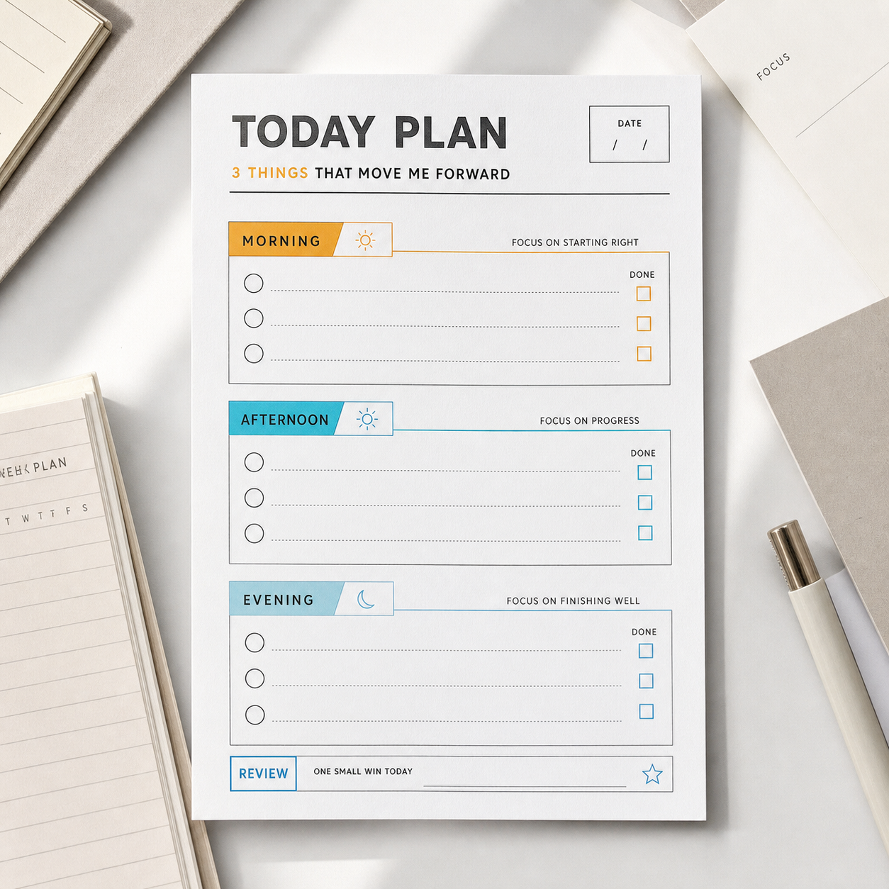
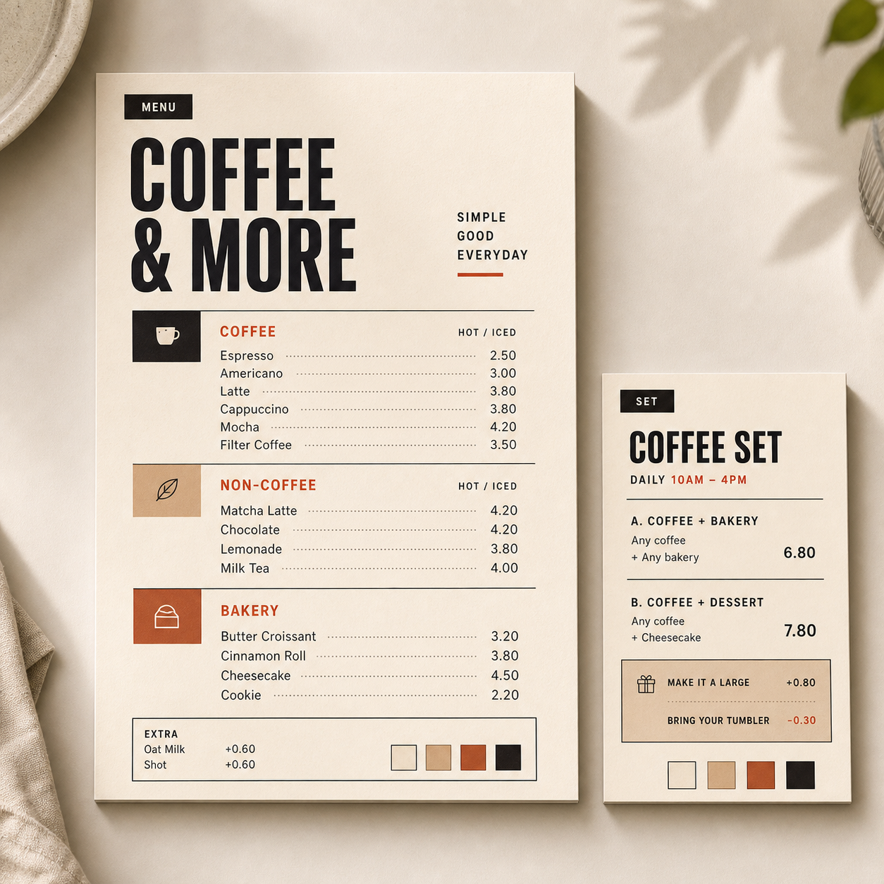
  • Useful for journal templates, cafe menus, gentle product explainers, and lifestyle guide covers.
  • Always test contrast before using the muted colors for small text.

可以替换的部分

配色角色

  • 背景底色
  • 柔和色块
  • 文字颜色
  • 小面积强调色

不适合这样用

  • 需要强促销海报时。
  • 品牌需要强技术信任感时。
  • 小字对比度不够时。

还能变成

  • 把粉色换成低饱和蓝,适合学习感。
  • 用更暖的棕色,适合咖啡菜单。
  • 增加白色比例,适合作品集页面。

使用注意

  • 检查文字对比度。
  • 不要让所有颜色面积一样大。
  • 让一个颜色占主导。

适合场景

生活方式手账小店

相关灵感

继续看相近的结构、风格或使用场景。